
A high conversion rate is an essential element in an income generating search strategy. It is imperative that you turn the site visitors into buyers because that is the core reason for advertising.
There are major places you need to pay key attention to increase conversion rates in your store.
In the plight of eCommerce entrepreneurs to increase and boost sales through retargeting campaigns, they always try to collect as many emails as possible for these campaigns.
The question is, where do we put the forms so that they are most effective to boost conversion rates?
15 Places to Add Opt-in Form for Higher Conversion Rates
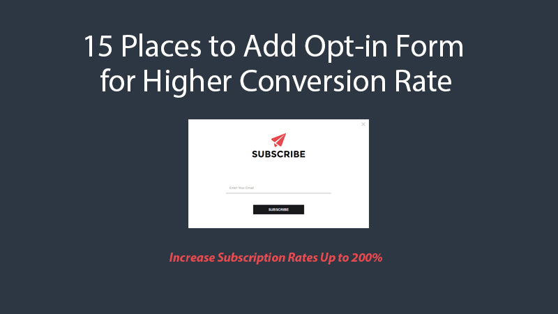
Discussed below are areas to add opt-in form in your website for higher conversion rate. We have experiment and conversion rate increased by 200% within a week. Let’s check the places where to put subscriber forms.
1. Opt-in In Email Sign up Forms to be Used
You need to make sure that the forms are industry specific. It is a world of exposed millennial buyers who not only focus on the product but also the shopping experience they receive during their site visit.
The millennial buyer is known to be niche specific and thus gets easily irritated when the site and sign up forms are not product specific.
In the specific site purchase adventures, you should always look for specific products in search engines and less often engages in impulse buying unlike in physical shopping sprees.
Thus as an eCommerce entrepreneur has to make sure the forms are industry-specific and time relevant. Forms should be availed when needed and should be purpose discrete.
This will make it more convenient for your site visitors thus increasing conversion rates.
2. Including the Feared Lightbox Pop-ups
This is always a dreaded method as most entrepreneurs feel it is irritating. In as much as it may look irritating, it is always a great way to grab emails in certain overwhelmingly loved passion niches.
In a passion niche, the site visitor is always ecstatic about the products and thus in this enthusiastic mode, they rarely care about pop-ups. It is a niche they are in love with and are very savvy about.
This, however, doesn’t work in other niches that visitors are not passionate about. It is advisable to be discretely used in sites with products that people are really passionate and savvy about.
You are also advised to be discrete with the traffic they drive into their sites.
3. Placing the Form on Little Bar Across the Top of Your Site
This is always a bar across the top of your site. Majorly it’s always a viper bar or a hello bar. This greatly works in your bid to grab emails.
It is attention catching and thus when people visit your site they are less likely to miss it as it stares right at them. Through this, you can collect a large number of emails for future marketing campaigns.
4. Providing Information on Your About Page
Many site owners often ignore this essential part. You are advised to set up Google Analytics. This is essential in tracking traffic on your site.
Through this, you are able to know the most popular pages on the site. This knowledge comes in handy when it comes to determining the location you should put his email sign up forms.
Normally, it is always the about page that is always most popular on most sites. Site viewers always want to know about the site before venturing into other pages.
With that traffic, it is wise to move fast to put up at least 3 email sign up forms on that particular page lest you lose lots of emails daily.
Thus you are also putting to drain the capital you used to drive the traffic to your site. Countless other site owners have become prone to this mistake.
5. Placing Opt-ins in the Footer of Your Site
This works well and always a sure way of gauging your visitor’s engagement with the site. It is quite logical that they like your page when he browses till the footer. In cases of dislike viewers always leaves the site before reaching the footer.
So when somebody reads till the footer, they are definitely engaged with your content. And if it’s the case, you are supposed to ask them for action right away.
This is where you bring up an email sign up form in your footer. This works with all kinds of sites and is not bound to specific niches.
6. Bringing up Forms After Single Posts
When should you bring up forms? In this strategy, we are trying to woo the visitor with content first and when the goes through the content to the end we try to bring up sign up form.
This is banking on the higher probability that the viewer likes the content thus he/she has read the content to the end. This yields a good conversion rate as you are able to propose to the reader when he already has a positive of about you.
It is thus wise to use this strategy consistently. Plain content without sign up forms is tantamount to inhibiting your own growth.
7. Placing the Form on Top of Sidebar
In this location; your sign up form looks more significant and visible. Placing it on adverts or below your sidebars is a sign of insignificance and thus the viewer diminishes its importance. This will lead to one loosing very many valuable subscribers.
This works across all sites, psychologically viewers deduce importance based on the location of the form if the ad of the bar comes first, they will click the bar and forte the email.
Thus it is imperative to create that importance impression least you continue losing subscribers.
8. Placing Opt-ins in the Feature Box
The feature box acts as a great tool to evaluate your headers. The feature box converts well and thus can be used as benchmarking tool on how effective the headers are. These trivial questions asked always help in one collecting emails.
You can ask a current trending question and collect emails when receiving answers. You would also ask a challenging question based on the niche he is in and asks for emails in order to send the answer.
This works really well and has been known to convert highly. It is also applicable to all niches and thus not bound to any rules or niches. It is good to make sure the trivial question is industry relevant.
9. After Relevant Information Inquiry
This one is simple, the more simple and less the information you inquire, the more people sign up. The main goal should be getting the email. You should desist from asking long and lengthy information in this form.
When it becomes tedious the viewer is put off. It is thus advisable to get the email first and then ask for other information after acquiring the list. After getting the email, the situation changes and it’s no longer an all or nothing situation.
You should always make sure that the core reason for bringing up the form is the email listing first. The rest of the information can be communicated later via the contact form.
By doing this one’s increases the conversion rates as the viewer is less likely to be put off by lengthy forms. Applicable in sites all across the board.
10. After Good Understanding Target Audience Data
You should be able to have a target audience in mind. It is meaningless to craft forms without knowing who you are targeting and want in your email list.
Without this insight, you are not able to effectively design an appropriate form that will spark the interest of his specific audience.
It is thus imperative for site owners to understand the specific audience he is targeting for the email list. Internet marketing is often niche specific and less supportive of general campaigns.
Often when a viewer uses the search engine they are always precise on a certain topic or product they are looking for. This is really effective and helps you boost conversions rates as you are able to draft forms that appeal to his specific audience.
11. Essential Grafting of Form Strategy
Opt-in pages have essentials that must be included in a bid to increase conversion rates. The draft has to have a headline that is attention catching. The headline is the score for the whole thing thus you should make sure it is catchy.
The benefit then follows, and in this, the strategy includes highlighting the benefit of signing up. Then there comes the call to action button, here you have to politely ask people to sign up.
The last part is the opt-in form and should look good. There are things that also could help in increasing conversion rates. You should attach testimonials, reviews, and even media mentions.
This entirely depends on the strength of your brand. The method you’re using to traffic also affects the type of proof you need to include. Random traffic like from Google AdWords will need you to be at your best.
12. Opt-ins After Incentives
Your page should have benefit for people to subscribe. It is a smart guy thing to bring up an upfront benefit page before bringing the form. This is also called the ethical bribe.
It goes a long way in helping you convince your subscribers. This incentive comes in different forms like free webinars, videos, and even giveaways.
This strategy still works on most pages and if o gets irritated he/she wasn’t meant to be, don’t beat yourself for it. These should be included in the autoresponders.
You also need to include future incentives. The main purpose for this is to make the viewer feel is getting more than he is receiving from the page. Occasionally this increases conversion rates.
When the viewer feels he/she stands to gain from the site, this dismisses fears and even increases loyalty. You would, for instance, say sign up to get this free webinar or giveaway.
This has worked effectively and people experience high conversion rates.
13. Opt-ins After Reviews and Testimonials
The reviews and testimonials come in handy as convincing tools. This helps convince site viewers to sign up as they see results of other people benefiting from the page.
You should strategically structure the page in a way that reviews and testimonials come before the sign-up forms. Many people are often bound to sign up the forms after seeing good reviews.
This does not only increase the number in your email list, but also the strength of your brand. It thus increases the probability of conversion rates, unlike the people who don’t have the reviews and testimonials.
14. Including Opt-ins in Help Forms
Normally, sites have a contact us sheet, you should make sure these contact pages have opt-in forms.
This is because for a viewer to try to reach out, he/ she has an incentive of staying longer in your site a sign that they are well engaged with your content or products. You should always make sure they capture viewers information.
This will help grow your list as, unlike pages that offer phone numbers as help points. You are bound to lose a lot of subscriptions when they use other ways of contact as the help methods or inquiry.
You are obliged to always make sure his/ her site has gaps that raise a question or leaves a desire to know more attitudes on their content/product viewers.
When suspense is raised even the random traffic driven to his account are bound to engage and try to reach out for more queries. Always leave your audience thirsty for more!
15. Welcome and Exit pop-ups
Site owners should include welcome pop-ups and exit intent pop-ups. In as much as full-screen welcome mats may seem irritating, they always play a significant role in compelling viewers to subscribe to your email list.
They are always huge and cover the whole page thus the site visitor is not likely to miss it.
It also works as an incentive to the viewer to be notified in case new content or product arrives. This is always advisable to be used by sites that already have a strong trusted brand.
It might be a conversion killer for small sites without fanatic following, thus do not use before building your brand.
Did we miss any vital place to put opt-ins form on? Can you share your strategy to increase higher conversion rate? Leave a comment with your question or feedback, we’ll appreciate it.
you will love the following articles:
- How to Research Long Tail Keywords for Affiliate Marketing
- 25 Highly Effective Ways to Promote Your Product on the Internet
- 25 Tips for Conversion Focused Landing Page Design
- How to Create a Global Internet Identity(GII) by Gravatar
- How to Research Competitors Using Semrush Keyword Research Tool
- How to Research Keyword Using Long Tail Pro (Step By Step Guide)
